


GARVEE 12-16.5 12PR Tire – Durable Construction for Heavy-Duty Applications, Max Load Capacity of 6316 LBS, Reliable Performance
Description
GARVEE 12-16.5 12PR Tire – Durable Construction for Heavy-Duty Applications, Max Load Capacity of 6316 LBS, Reliable Performance
- High-Performance Tire: Our 12-16.5 12PR tire offers exceptional performance for heavy-duty applications, providing optimal traction and stability.
- Durable Construction: With a 12-ply rating and H load range, this tire is built to withstand rugged terrains and heavy loads with ease.
- Reliable Speed Range: The A8 speed range ensures safe and efficient operation, allowing for reliable performance in various driving conditions.
- Impressive Load Capacity: With a maximum load capacity of 6316 LBS, this tire can handle heavy loads effortlessly, making it suitable for industrial and commercial use.
- Precise Specifications: With an overall diameter of 83 cm, section width of 10″, aspect ratio of 66, and rim diameter of 16.5″, our tire offers precise dimensions for a perfect fit and optimal performance.
Specifications
| Brand | GARVEE |
| Seasons | Year Round |
| Size | 12-16.5 12 Ply |
| Rim Size | 9.75 Inches |
| Section Width | 30 Millimeters |
| Tire Aspect Ratio | 80 |
| Load Index | 80 |
| Speed Rating | G |
| Load Capacity | 6315 Pounds |
| Tread Depth | 23 32nds |
| Ply Rating | 12-Ply |
| Item Diameter | 83 Millimeters |
| UPC | 196336083005 |
| Model | Heavy Duty Tire |
| Item Weight | 97 pounds |
| Construction | Bias |
.aplus_module STANDARD_PRODUCT_ATTRIBUTES h3{
margin-bottom: 10px;
}
.responsive-table {
border-collapse: collapse;
width: 100%;
margin-bottom: 20px;
}
.responsive-table td {
border: 1px solid #ddd;
padding: 8px;
text-align: left;
}
.responsive-table tr:nth-child(odd) {
background-color: #F2F2F2;
}
.responsive-table tr:nth-child(even) {
background-color: #E6E6E6;
}
.responsive-table tr:hover {
background-color: #DDDDDD;
}
@media screen and (max-width: 800px) {
.responsive-table td {
box-sizing: border-box;
width: 100%;
text-align: left;
padding: 10px;
}
.responsive-table tr:nth-child(odd) td {
background-color: #F2F2F2;
}
.responsive-table tr:nth-child(even) td {
background-color: #E6E6E6;
}
.responsive-table tr:hover td {
background-color: #DDDDDD;
}
}
.aplus_module{
margin-bottom:24px;
}
.aplus_module img{
width:100%;
}
.aplus_module h1,h2,h3,h4,h5,h6{
margin:0 !important;
}
.count_imgs_wrap{
display:flex;
}
.count_imgs_wrap>div{
flex: 1;
margin-right: 30px;
}
.count_imgs_wrap>div:last-child {
margin-right: 0;
}
@media screen and (max-width:800px){
.count_imgs_wrap{
flex-direction: column;
}
.count_imgs_wrap>div{
margin-right: 0;
}
.count_imgs{
display:flex;
justify-content: center;
}
.count_imgs>img{
width:auto;
max-width:100%;
}
}
.img_floatleft{
display:flex;
justify-content:space-between;
}
.leftwrap{
flex:3;
display:flex;
}
.lefttext{
margin:0 30px;
}
.lefttext>ul{
padding:0;
}
.lefttext>ul>li{
padding-bottom:18px;
}
.rightwrap{
flex:1;
}
.rightwrap_inner{
border-left:1px solid #dddddd;
padding-left:30px;
}
.rightwrap_inner>ul{
background-color: white;
padding:18px 32px;
border-radius: 8px;
}
@media screen and (max-width:800px){
.img_floatleft{
flex-direction: column;
}
.leftwrap{
flex-direction: column;
flex: initial;
}
.leftimage{
display:flex;
justify-content: center;
}
.leftimage>img{
max-width:100%;
width:auto;
}
.lefttext{
margin:0;
}
.lefttext>ul{
padding-left:32px;
}
.rightwrap{
flex: initial;
}
.rightwrap_inner{
border-left:0;
padding-left:0;
}
.rightwrap_inner>ul{
padding-right:0;
}
}
Additional information
| Style | 12-16.5 |
|---|
Related products
-
- Sale!
- Ko-ken, Ko-Ken
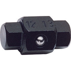
Ko-ken 106-14Hx17H Bit 12mm x 13mm Hex x Hex Length 32mm on Sale
- Original price was: $10.04.$4.02Current price is: $4.02.
- Add to cart
-
- Sale!
- Ko-ken, Ko-Ken
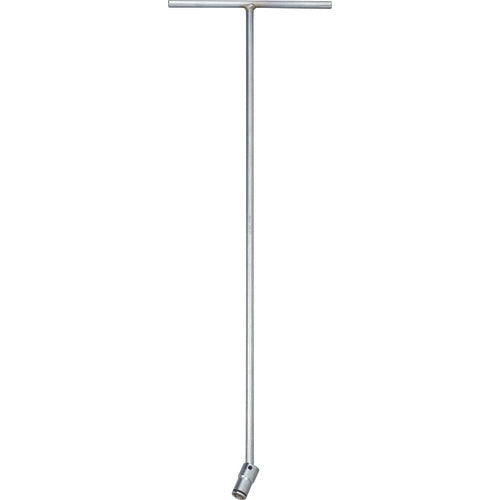
Ko-ken 124M.600-17(2B) T Handle Universal Socket 17mm Nut Grip Length 600 x 200mm on Sale
- Original price was: $81.70.$24.51Current price is: $24.51.
- Add to cart
-
- Sale!
- Ko-ken, Ko-Ken
Ko-ken 106-19H Bit 14mm x 17mm Hex Length 24mm
- Original price was: $10.51.$4.20Current price is: $4.20.
- Add to cart