
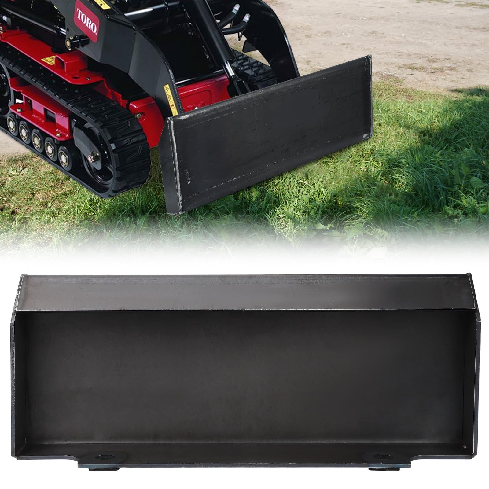


GARVEE 1/4″ Mini Skid Steer Loader Attachment Plate Quick Attach Mount Plate Compatible with Dingo Ditch Witch,Support Welding Fabrication Attachments
Description
GARVEE 1/4″ Mini Skid Steer Loader Attachment Plate Quick Attach Mount Plate Compatible with Dingo Ditch Witch,Support Welding Fabrication Attachments
- BASE MOUNT PLATE: Designed to your specifications, this mount plate lets you easily weld or bolt on other attachments for a quick tach mounting system. It comes unpainted and ready for welding.
- SIMPLIFIES TASKS: This skid steer mount plate allows you to add virtually any attachment, making tasks like plowing snow, removing debris, and transporting scraps more efficient.
- EASY WELDING SURFACE: This quick attach adapter features a large surface, ideal for welding and simplifying your DIY installation. Just weld or connect the attachments to the mounting plate.
- FITS MINI SKID STEERS: Fits most mini skid steer loaders, including Toro Dingo, Ditch Witch, Multi One, Ram Rod, Vermeer, Finn Eagle, Boxer, Thomas, and others with Toro style mounting (NOTE: It does not fit Bobcat, Kanga Kid, or Prodigy).
- STURDY MATERIAL: Crafted from grade 50 structural steel, this mount plate ensures exceptional strength and can handle heavy loads without bowing or bending. Its enhanced resistance to corrosion guarantees years of reliable use.
Specifications
| Part Number | EhMcpRzJU1rAsrPJ1b7GSAGubh1g |
| Item Weight | 30 pounds |
| Product Dimensions | 26 x 12 x 5 inches |
| Size | 1/4″ |
| Power Source | hand_powered |
| Item Package Quantity | 1 |
| Included Components | 1* Skid Steer Mount Plate |
| Batteries Required? | No |
.aplus_module STANDARD_PRODUCT_ATTRIBUTES h3{
margin-bottom: 10px;
}
.responsive-table {
border-collapse: collapse;
width: 100%;
margin-bottom: 20px;
}
.responsive-table td {
border: 1px solid #ddd;
padding: 8px;
text-align: left;
}
.responsive-table tr:nth-child(odd) {
background-color: #F2F2F2;
}
.responsive-table tr:nth-child(even) {
background-color: #E6E6E6;
}
.responsive-table tr:hover {
background-color: #DDDDDD;
}
@media screen and (max-width: 800px) {
.responsive-table td {
box-sizing: border-box;
width: 100%;
text-align: left;
padding: 10px;
}
.responsive-table tr:nth-child(odd) td {
background-color: #F2F2F2;
}
.responsive-table tr:nth-child(even) td {
background-color: #E6E6E6;
}
.responsive-table tr:hover td {
background-color: #DDDDDD;
}
}
.aplus_module{
margin-bottom:24px;
}
.aplus_module img{
width:100%;
}
.aplus_module h1,h2,h3,h4,h5,h6{
margin:0 !important;
}
.count_imgs_wrap{
display:flex;
}
.count_imgs_wrap>div{
flex: 1;
margin-right: 30px;
}
.count_imgs_wrap>div:last-child {
margin-right: 0;
}
@media screen and (max-width:800px){
.count_imgs_wrap{
flex-direction: column;
}
.count_imgs_wrap>div{
margin-right: 0;
}
.count_imgs{
display:flex;
justify-content: center;
}
.count_imgs>img{
width:auto;
max-width:100%;
}
}
.img_floatleft{
display:flex;
justify-content:space-between;
}
.leftwrap{
flex:3;
display:flex;
}
.lefttext{
margin:0 30px;
}
.lefttext>ul{
padding:0;
}
.lefttext>ul>li{
padding-bottom:18px;
}
.rightwrap{
flex:1;
}
.rightwrap_inner{
border-left:1px solid #dddddd;
padding-left:30px;
}
.rightwrap_inner>ul{
background-color: white;
padding:18px 32px;
border-radius: 8px;
}
@media screen and (max-width:800px){
.img_floatleft{
flex-direction: column;
}
.leftwrap{
flex-direction: column;
flex: initial;
}
.leftimage{
display:flex;
justify-content: center;
}
.leftimage>img{
max-width:100%;
width:auto;
}
.lefttext{
margin:0;
}
.lefttext>ul{
padding-left:32px;
}
.rightwrap{
flex: initial;
}
.rightwrap_inner{
border-left:0;
padding-left:0;
}
.rightwrap_inner>ul{
padding-right:0;
}
}
Additional information
| Color | none |
|---|
Related products
-
- Sale!
- Collectable Sign and Clock, Wall Clocks
Collectable Sign and Clock – 1949 Chevrolet Truck Clock
- Original price was: $169.99.$42.50Current price is: $42.50.
- Add to cart
-
- Sale!
- Collectable Sign and Clock, Wall Clocks
Collectable Sign and Clock – 1955 Bel Air Mitch’s Garage Clock Sale
- Original price was: $169.99.$42.50Current price is: $42.50.
- Add to cart
-
- Sale!
- Collectable Sign and Clock, Wall Clocks
Collectable Sign and Clock – 1954 Chevrolet Truck 2 Clock
- Original price was: $169.99.$42.50Current price is: $42.50.
- Add to cart